Navigating through application
Login
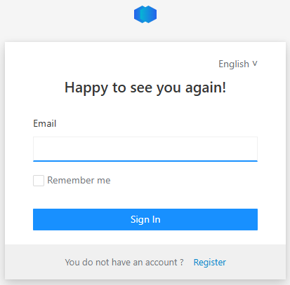
To login go to https://app.product-live.com
First enter your email address
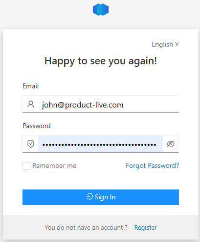
Then enter your password
Change language
To change the language, click on your initials at the top right of the application, then select the desired language:
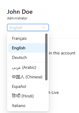
This will update:
- The language of the application menus
- The language used for the column headers and the option lists (only available if your administrator or your partner has configured the multilingual support for the language selected, otherwise the default language is used)
Tip
In the help-center you can click on images and animations to see them displayed in large.
Choose account
From the header menu, you can see on which account you are connected. And from there you can switch account. If you have many accounts, you can search them to easily see to the desired data.

Choose context
From the header menu, you can see on which context you are connected. And from there you can switch account. If you have many accounts, you can search them to easily see to the desired data.

Choose table
From the header menu, you can see on which table you are viewing. And from there you can switch tables. If you have many tables, you can search them to easily see either product, logistics units, spare parts, supplier list and so on.

Choose partition
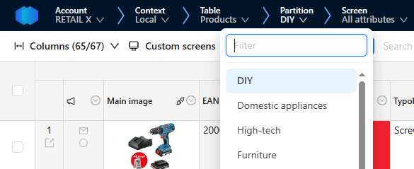
From the header menu, you can see on which partition you are viewing. And from there you can switch partition. If you have many partitions, you can search them to easily see various kind of products: DIY, Domestic Appliances, High-Tech and so on.
Choose screen
From the header menu, you can see on which screen you are viewing. And from there you can switch screen. If you have many screen, you can search them to easily see to different kind of product data: referencing, enrchiment, marketing, purchasing and so on.

Editing
Editing can be done in bulk as you would do in a spreadsheet software like Microsoft Excel or Google Spreadsheet.
Keyboard shortcuts
Here are the keyboard shortcuts enabling you to quickly edit your product data.
- Move selection : ⇧ , ⇩ , ⇦ , ⇨
- Select all : Ctrl + A (or Cmd + A according to your operating system)
- Go to first field or value start : Home
- Go to last field or value end: End
- Validate and/or go to next field : Tab
- Validate and/or go to previeous field : Shift + Tab
- Edit or select an option/category : Enter
- Validate and got to next line : Ctrl + Enter (or Cmd + Enter)
- Line break : Shift + Enter or Alt + Enter
- Copy : Ctrl + C (or Cmd + C)
- Paste : Ctrl + V (or Cmd + V)
- Cancel action : Ctrl + Z (or Cmd + Z)
- Restor action : Ctrl + Y (or Cmd + Y)
- Delete selection : Del
- Cancel an action or close : Esc
- Preview : Space
- Search field : Ctrl + Shift + F
All existing shortcuts apply to composite fields as well, and additional ones enables to navigate more easily:
- Dig in a composite field: Enter or Space
- Dig out a composite field: Escap
Note that Escap key enables you to go to the parent composite field, until the top one. Then it enables you to go back to the product on the Grid and Detail View.
Basics
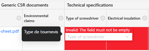
To edit a cell double click on it.
Depending on the data type of the column (text, list, number, image...) you will view a specific editor:
Drag down
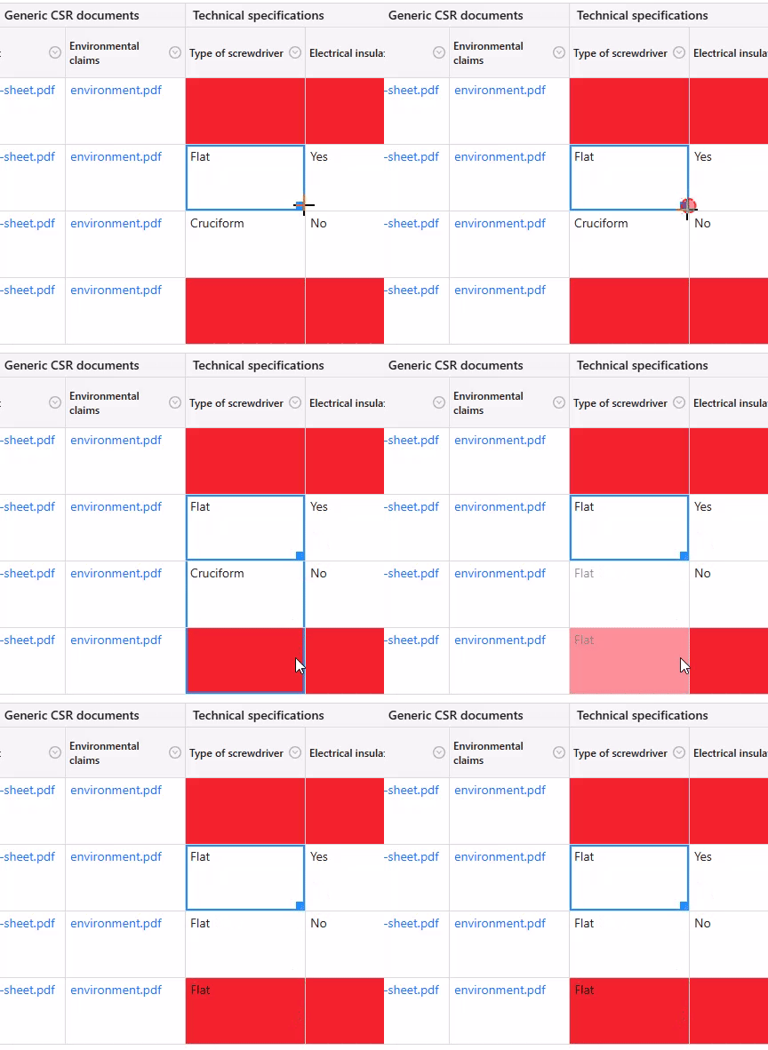
You can drag down a cell to copy its value:
Copy/Paste
You can use the shortcuts:
- Ctrl + C to copy
- Ctrl + V to paste.
And use the arrows to navigate between cells.
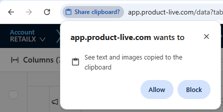
The first time you will use the Copy/Paste, you will have a security message, click the allow button:
Undo
Use the shortcut Ctrl + Z to undo what have been done.
Select and copy multiple cells
Copy/Paste can be done:
- From Product-Live to Product-Live
- From Product-Live to a spreadsheet software
- From a spreadsheet software to Product-Live
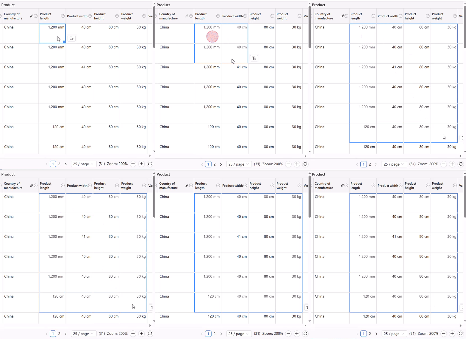
To copy multiple cells click on a cell, and then use ⇧ + Click on another cell:
Tip
With this feature, you can easily duplicate a product's attribute to others and amend the few differences manually. For example, two products are the same but the color is not.
Or you can use the shortcut Ctrl + A to select all visible cells.
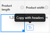
You can also copy the headers by clicking this button:
Drag and drop images
You can drag and drop images in the grid within the same line.
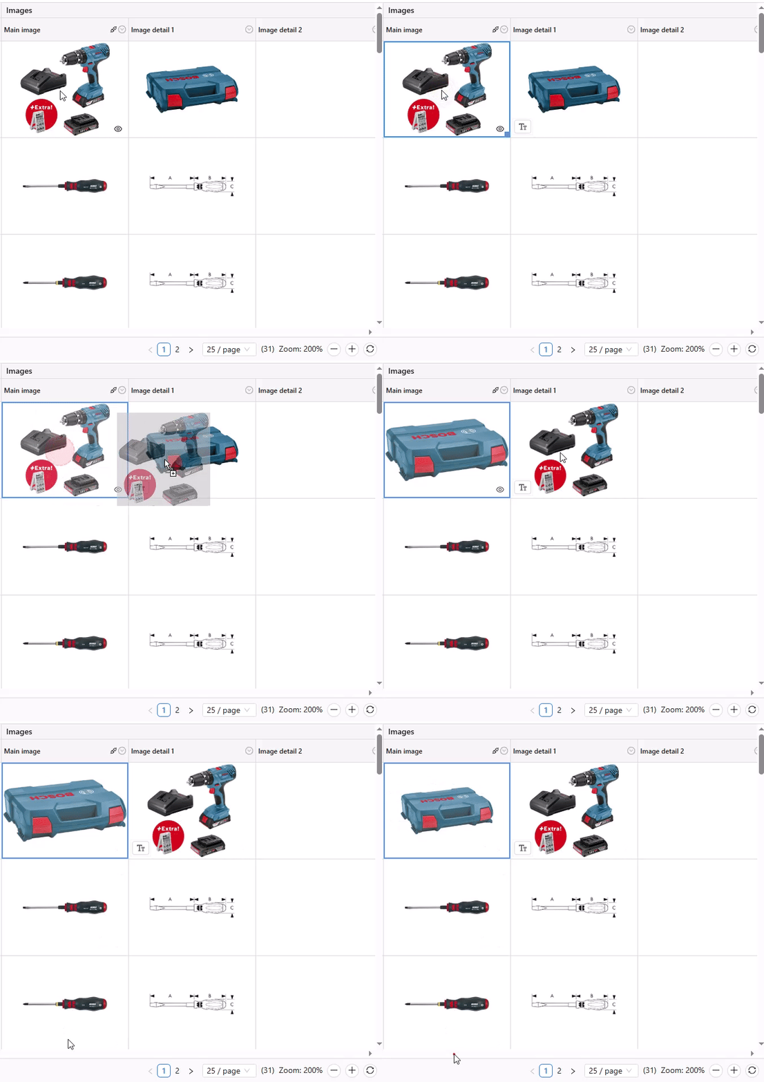
To import images or files you must double click on the cell, you cannot drag and drop images or files on the grid.
One click preview on texts
WARNING
The Markdown viewer is only available on LONG-TEXT fields.
For texts, you can display the entire content formatted in Markdown to enhance readability and presentation.

One click zoom on images
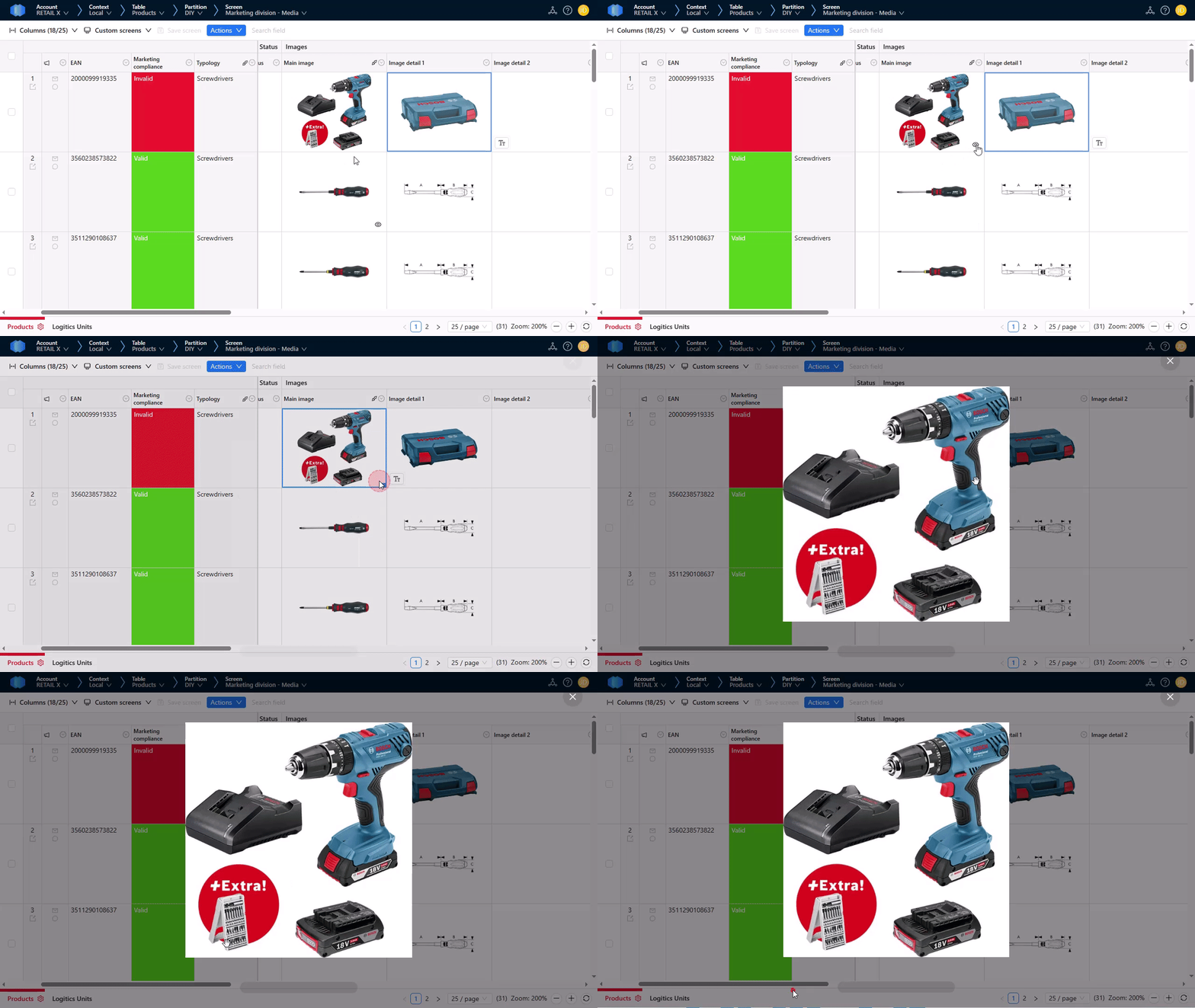
For images, you can display it in full screen with a one click action:
Conditional formatting and what left to be done?
Conditional formatting allows to automatically highlight a cell on conditions.
A good usage to present this feature is a Products table in which you want to define rules like "This field must be required", "This field must be less than 300 characters"...
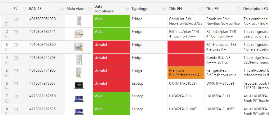
Conditional formatting columns will be displayed like the column Data compliance below and cells are highlighted with colors depending on the rules defined on it:
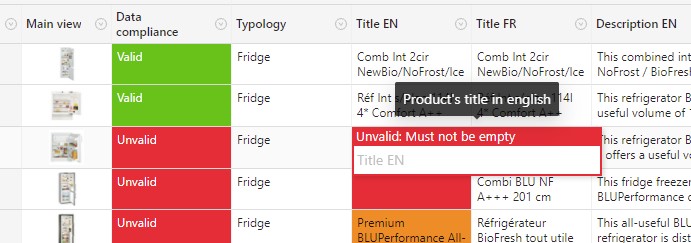
When you edit a cell, depending on the rules a message is displayed to correct the problem:
And when you want to know what is left to be done on an item, you can click on the cell of the conditional formatting column to get the summary:

In this panel, you can also click on the attribute title to be directly redirected to the concerned cell:

Use the Detail view
This allows to have a single and larger view on an item:
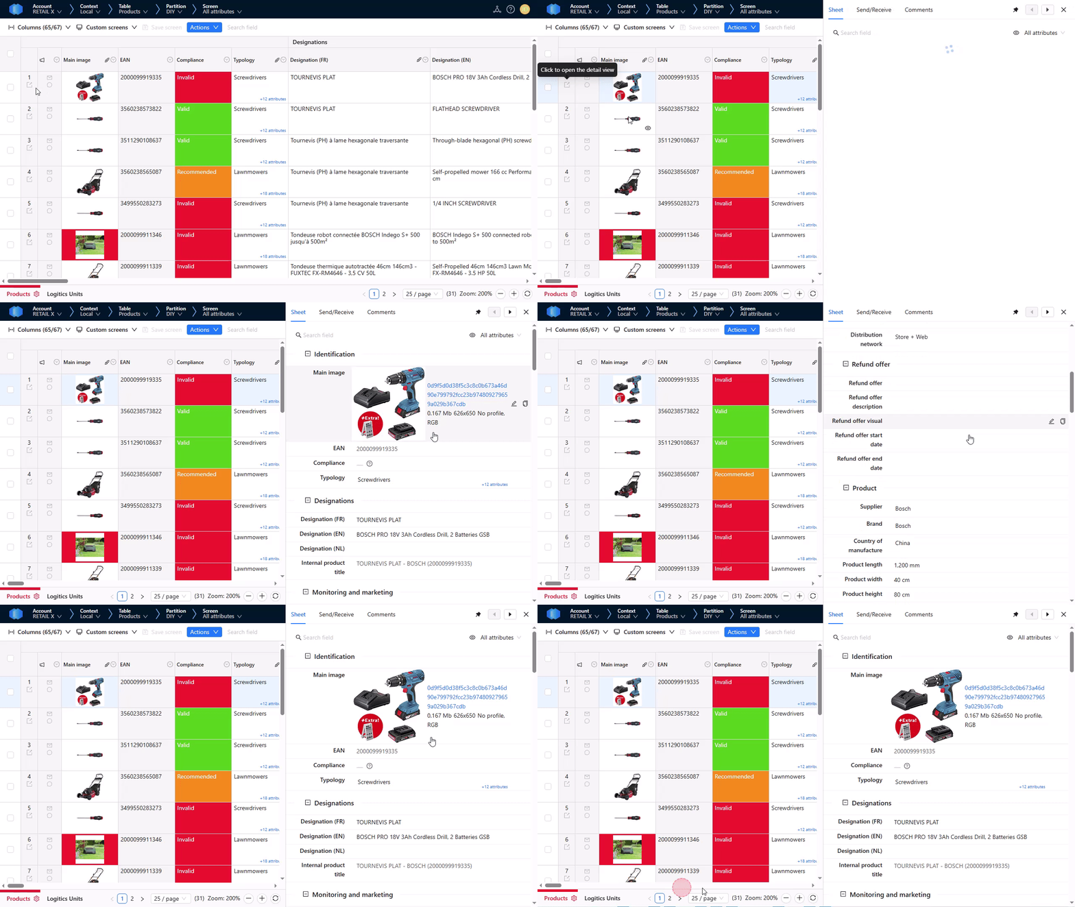
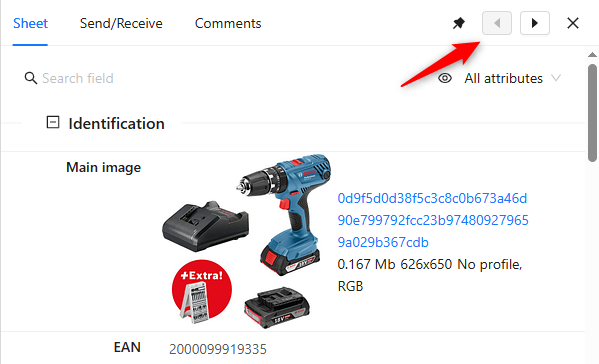
You can get the previous/next item here:
You can change the screen of the data sheet panel here:
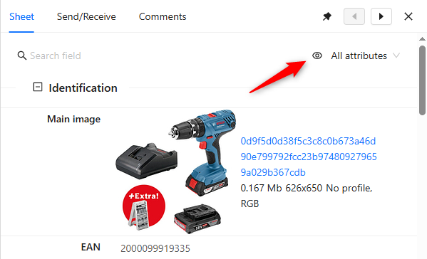
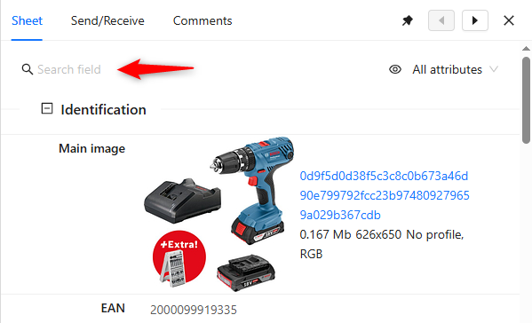
You can search for attributes here:
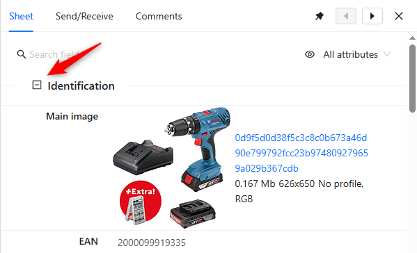
You can open/close sections here:
Composite fields
Composite field
The COMPOSITE field is in phase. You can contact the Product-Live team at contact@product-live.com if you want more details and get an early access.
As composite fields are composed of multiple fields and/or values, no value is displayed in the grid. Instead a link enables you to open a screen to consult and edit it.
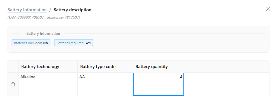
Once opened, you can see all the fields composing it, and edit them as you do in the grid. In addition, you can see up to three item field references helping you know which item you are viewing.

According to the composite field setting, you may add multiple lines by clicking on the + line. And you can delete lines with the bin button at the beginning of the line. Be aware that there is not rolling back after deleting a line.
If there are composite fields within a composite field, you can dig down. Then you will see the breadcrumb allowing you to navigate within the composite field. And you will see parent field values helping know which line you are viewing.
Set item reference fields display
You have the flexibility to select which item fields are displayed within the composite field screen for reference, by using the pin/unpin columns feature on the grid.

Only the first three textual pinned fields are displayed in the composite view for quick reference. Images, attachments and other composite fields are not displayed. Empty fields are note displayed.
Search fields
There can be dozens or even hundreds of columns on the grid making it hard to find the desired field. That is also the case in the detail view and in composite fields.
| Grid | Detail View | Composite field |
|---|---|---|
 |  | 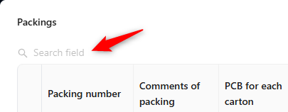 |
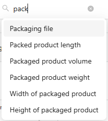
To help you find the field you need to fill or check you can use the Search field. You can access it on top of the grid, the detail view and the composite fields. You can also access it withe the keyboard shortcut Ctrl + Shift + F. There any field having its title or key matching your search will be listed.
Filtering and sorting
Do it like you do it in softwares like Microsoft Excel or Google Spreadsheet:
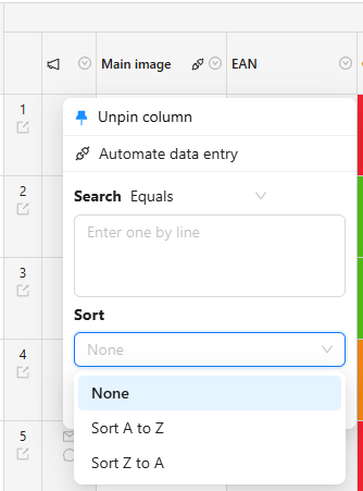
Depending on the data type of the column you will find different options on filters:
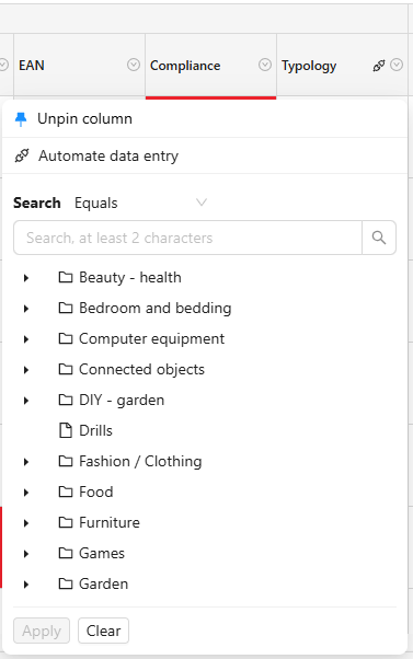
Advanced filtering
You can select the kind of search, for example for text fields:
- Equals
- Contains
- Starts with
- Ends with
- Empty
- Not empty
Each data type has its own filtering and sorting solutions.
Sorting
Do it like you do it in softwares like Microsoft Excel or Google Spreadsheet:

Classification quick filtering
Since there may be multiple product categories with the same name, it can be difficult to filter items on the desired category and see their specific attributes. You can solve this problem by filtering on the category of the item on the grid.
And when you fill your items for your partner, you may not know if there are specific fields for the item category. You can solve this problem by seing if there are specific field to the category and filter on it on the grid.
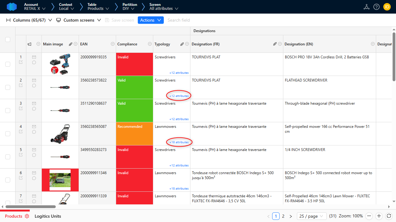
As for the classification header filter, items of the selected category and sub categories are displayed in the grid.
Custom screens
Show/Hide columns
You can easily customize the screen by choosing to display or hide specific columns. That can help you focus on the most relevant information, streamlining your activity and minimizing visual clutter.
With just a simple click, you can check or uncheck columns to display, ensuring that the display perfectly aligns with your needs and preferences.
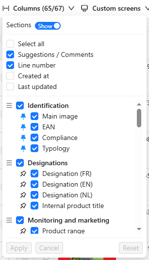
This can also be used to display two columns that are hidden by default:
- Created at: The creation time of the item
- Last updated: The last updated date of the item
Pin/unpin columns
You can easily lock columns of the screen, ensuring that critical data remains visible, such as product name, category or Id, as you scroll through other columns.
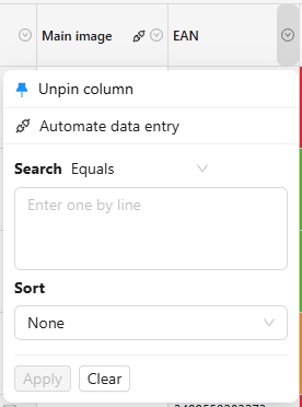
With just a simple click, you can pin or unpin columns, providing flexibility and efficiency in managing large sets of product information. Either from the Columns menu or each column header menu.

By default, some columns are frozen. That is the screen definition set by the admin. You can override this setting for yourself.
You can also pin/unpin columns from each column header menu.
Reorder columns
You can easily reorder columns and sections of the screen, ensuring that critical data are visible in the way you need them, such as the EAN, the category , the main image and then the other columns.
You can drag and drop each column and section in the desired order, providing flexibility and efficiency in managing large sets of product information.

Screen settings
In addition to the ability to filter items, show or hide, pin or unpin, and reorder columns, you can also save your screen settings. This feature allows you to easily reuse your customized layout the next time you engage in a similar task.
Next to the columns menu, you can find the screen settings, where you can view and manage all your configurations. When filtering or adjusting columns, you can quickly update a screen settings with the new configuration.

Your screen settings are private and not shared with anyone else. If you want to share them, simply copy and paste the Product-Live URL to your colleague. They can then save it as their own screen settings.
Grid custom screen
As you can save your screen settings, you can easily reuse them whenever needed on the grid.
Saved screen settings are displayed next to the columns menu. Here, you can view, select, and apply any saved configuration to refresh the screen with your preferred filters and customizations.

Detail view custom screen
As you can save your screen settings for easy reuse, you use them on the view to display exactly the information you need.
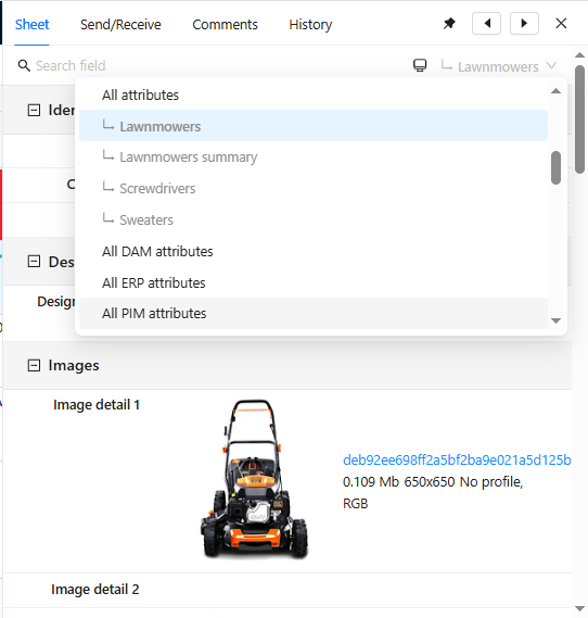
In the detail view, the available screen settings are listed in the screen list below the default screen used to create it.
Please note that only the column configurations (show/hide, pin/unpin, and order) are applied in the detail view. Filters are not applied.
Additionally, it is possible to apply different screen settings simultaneously to both the detail view and the grid, enabling further customization.
Actions
Actions allow to export or import data. They are configured by your administrator or by your partner.
Execute action
To execute an action, click on the Actions button:
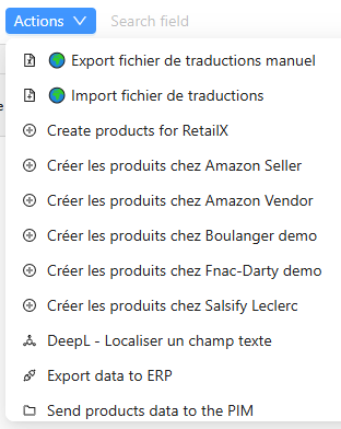
When you have selected the action that you want to execute, a form is displayed. Depending on the action you can have multiple user inputs. One user input is common to all actions:
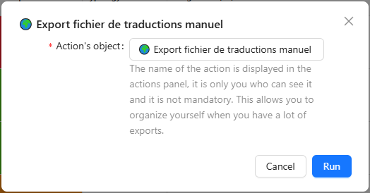
The action's name is the name that you want to give to this execution. You will understand what is used for in the Actions history section below.
You can wait until the execution has finished, but you can also continue the action in background using this button:
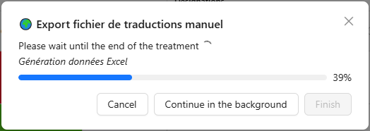
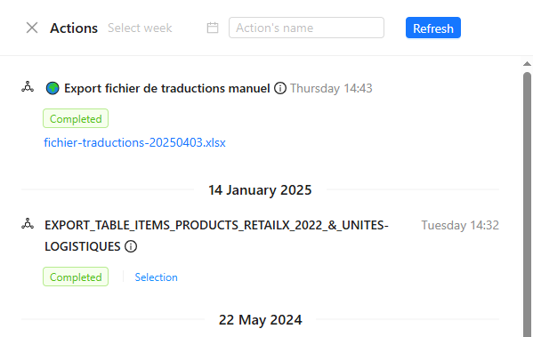
The action is automatically added to the Actions history panel.
Actions history
To open the Actions history panel click here:
This will give you a view of all actions that you have executed.
Zoom
You can change the zoom of the grid here:

To learn more on how to optimise your display view this tutorial: Display and zoom
Pagination
By default they are only 25 lines displayed by page. You can view the other results here:

What you have learned
Editing/filtering/sorting data has the simplicity of tools like Microsoft Excel or Google Spreadsheets.